Sushicafé Avenida - Saraiva + Asociados - Portugal
Architects: Saraiva + Asociados
Location: Lisbon, Portugal
Project area: 302 m²
Project year: 2011
Photographs: FG+SG – Fernando Guerra, Sergio Guerra
- Sushicafé Avenida – Saraiva + Asociados – Portugal
- Sushicafé Avenida – Saraiva + Asociados – Portugal
- Sushicafé Avenida – Saraiva + Asociados – Portugal
- Sushicafé Avenida – Saraiva + Asociados – Portugal
- Sushicafé Avenida – Saraiva + Asociados – Portugal
- Sushicafé Avenida – Saraiva + Asociados – Portugal
- Sushicafé Avenida – Saraiva + Asociados – Portugal
- Sushicafé Avenida – Saraiva + Asociados – Portugal
- Sushicafé Avenida – Saraiva + Asociados – Portugal
- Sushicafé Avenida – Saraiva + Asociados – Portugal
- Sushicafé Avenida – Saraiva + Asociados – Portugal
- Sushicafé Avenida – Saraiva + Asociados – Portugal
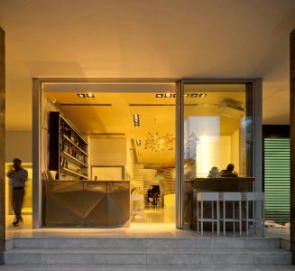
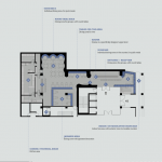
The great challenge of this project resided in the arrangement of four distinct areas – the Bar, Sushi Bars, Dining Area and Japanese Spot – yet concealing the T-shaped plan. The solid glass display creates a great interaction between the interior and exterior by revealing the dynamism occurring at the Bar, which was strategically placed at the entrance due to flexibility provided by the movable counters (indoor/outdoor). This layout combined with vibrant features circumvents the idea of greeting the visitors with a dull corridor.
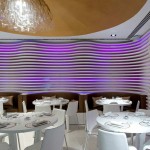
Once you enter SushiCafé you will feel submerged in a sophisticated environment replete with comfort. White as the predominant colour offers harmony and delicacy. It is present on the marble pavement, on the walls and on the lower ceilings. Now you ask what is so special about it. The walls, considered the main architectural trademark in the restaurant, consist of horizontal fibreglass strips which reflect an undulating composition. Reminiscing fluidity of music, they were designed not randomly but in accordance to the functionality they could provide. For instance, they transform into steps which climb into an elevated and projected platform, where the Disc Jockey enhances the lively atmosphere. These backlit white blades once merged with the translucent quality of this material create a warm glowing backdrop, which modifies the ambience according to the colour and intensity of light. The Sushi Bar in white corian (resin) located by the dining area adds a layer of personality to the ambience. This worktop destined for live cuisine presents a pattern that becomes clear from the subtle white beam. The lighting quality remains as a game of transparency and shadows, hence the inexistence of monotony and uniformity – a gradual and smooth change of tones.
Contrasting yet merging with the sophisticated whiteness, it was introduced a smooth gold colour that does not only add a hint of nobility but also a touch of warmth to the entire design. This exquisite tone preponderates in some unique furniture pieces. The Bar by the shop front grows from a perforated golden plate. The same language is reflected in the Japanese Spot, where the walls assume their shape in perforated panels. Also, lights rhythmically run across the ceiling bringing pools of lights on the dark tabletops.




No Comments