
Nestlé’s Chocolate Museum - Metro Arquitetos Associados - Brazil
Architects: Metro Arquitetos Associados
Location: Sao Paulo, Brazil
Project Area: 1,850 m²
Project Year: 2011
Photographs: Leonardo Finotti
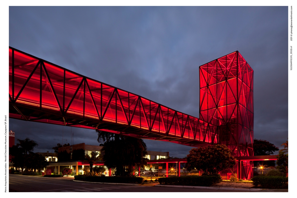
The intention in designing the structures of the public visiting of the Nestlé chocolate factory is to make a generic landscape of the highway that link Sao Paulo and Rio de Janeiro, the biggest Brazilian cities, revealing the presence of an area of visitation. This visibility is done by building towers to access the new route, in glass and steel, which in addition to the strong brand exhibition resolve the conflicting currents between production and visitation. The structural geometry and the materials used are designed to provoke a sensory and perceptual experience, and contribute to the seizure of information about the history and production of chocolate spread along the route.
The project is an intervention inside the Nestlé chocolate factory. Built in the 60’s, the tour was designed to receive external audience, but in a precarious manner and without museum character. The intervention resolved three main issues: conflict of flows between the external and public workers, make simple path through a museum with interactive content and, finally, to demarcate the existing building with strong character. We created two towers and walkways outside the factory, access a [lower] and another in the output [in front of the largest and Dutra], both composed by a set of stairs and elevator.
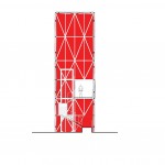
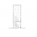
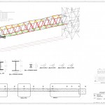
The metal structure of the towers and walkways is composed of tubular 100mm diameter, with variations in the thickness of the inner walls provided with that same detail of setting vedos either laminated glass panes with red film [south face], sometimes steel sheet brise expanded type [north side]. The floors are in perforated steel plate and contribute to natural ventilation and drainage. The roofs are in flat sheet steel top and bottom with EPS in the core for better acoustic and thermal performance.
The structure is composed of triangular modules non-coplanar 2.5m that are repeated every 10m. This configuration also aids in structural bracing and thus allow a more slender means that the plans reflect different glass figures of the landscape. The spans of the ‘bridge 1’ is 10 meters [supported on metal pillars and beams session variable] and the space between the ‘tower’ 1 and manufactures, 27.5meters. Already on the catwalk II, the gap between the tower and the pillar is 15m, and the balance to the mill is 5m. Inside the track, 10 core themes were designed according to the plant’s production, from raw materials, through the different stages of production to the final stage of packaging. Circular windows were opened at strategic points. Each core has colors, materials and character as distinctive soundtrack, narration and special scenery.





No Comments