Architects: Emre Arolat Architects
Location: Yalova, Turkey
Principal Architect: kerem piker, gülseren gerede tecim
Client: akkök grubu (limited competition)
Structural Project: osm engineering
Mechanical Project: mak-el
Electrical Project: sentez
Project Year: 2011
Project Area: 7,900 m²
It is possible to say that cities are made out of different contextual layers which time by time come near each other or on top of each other, even intertwine at times and ground their specific existing states. In the Yalova example peculiar to this city, oppositions between the main layers stand out.
One face of Yalova is its natural side. The endemic plants, areas where these plants are grown, exhibited and evaluated commercially, and even the most developed arboretums of the near geography are facts that determine the current existing state of the city. A colorful, joyful and vibrant world stands out. In this sense, it embodies an optimism, a feeling that the life is more joyous and trouble-free in this summer place.
Yalova is also an industrial city. Doubtless to say this face of Yalova’s existing state is not as trouble-free. It is hard to say it would be joyous and vibrant. Instead, the harder parts of life, labor and sweat come out. Compared to the other one, this world is more challenging.
It would not be wrong to say, without even questioning which face is more veritable, these two existing states that are totally opposites of each other have intertwined in this city, have fed of each other and even have created the city’s unique soul from the tension caused by the opposition. The relationship between the building which is a cultural center, the city and the people of the city is the primary vessel of the design. In this sense, it is aimed that the center mediates with the opposite layers of the city.
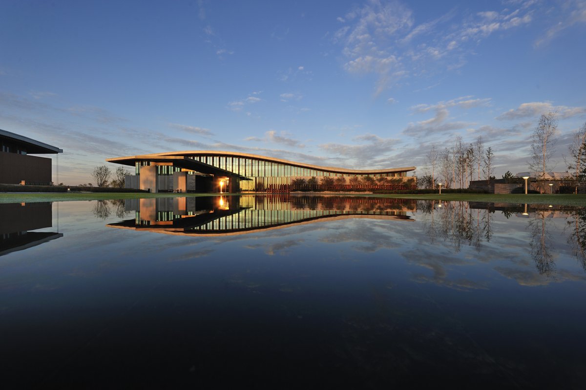
The building resigns to the west side of the site and leans to the edge in order to make space for the city garden that will be placed in front. The perception from the exterior does not give away to the shiny and dominant world of the recent cultural centers that want to monumentalize. Moreover, it holds off from this colorful, carefree yet imperious world. By doing this the ‘designed’ does not try to force an order, it does try to teach the ‘user’. Instead, the design is mostly ‘open-ended’.
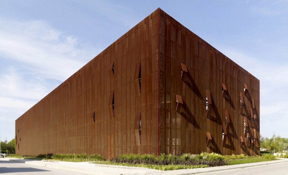
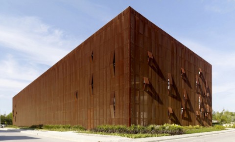
At first glance, the building does not reference to any shape. This objectivity that the building’s unlike to any shape mass creates, changes to the industrial character of the city as you get close to the building. Instead of the shiny and ostentations materials, the foraminous plates made out of resistant construction steel that was designed for facade sheating, was used to strengthen this feeling with their rusty surface. Citizens would recognize this texture easily as they have seen it in the production areas even though it had not been used on a building. The building now, has overgrown its new and stranger state ans has started to intertwine with the citizens. The surface which is also suitable for recycling, acts as a natural palette, containing the changes it will go through like the color and tone changes caused by oxidation. This movement will make the relationship between the city and the building more interactive.
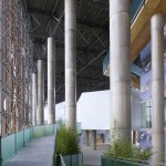
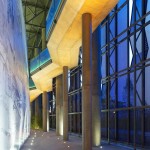
The fact that the facade is perforated provide the surface to dissolve at the night time like a tulle curtain and the inner would to be perceived easily. The user enters the building from its mouth. There is not a door or a barrier. The metal tulle now transforms into a protector. It leaves the negative impacts of rain, sun and wind but it does not transform into an interior space because of it semi-transparent nature. The air ventilates freely in this area.
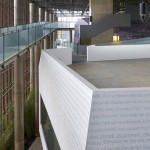
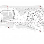
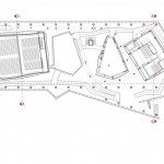
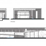
The masses in the building are shaped specificly to their different functions and necessary dimensions. Areas like 600 people capacity multi-purpose room, 150 people capacity workshop room, nuptial and exhibition rooms, library, office and cafeteria are related to each other from different elevations. These masses that are disconnected from the building facade and from each other, exist inside the building with their unique geometries. Their surfaces emphasize Yalova’s colorful and overgrown natural texture. It is aimed that the joyful image that various plants generate will appear beneath the surface of the facade as a second layer of exterior perception of the building just like it is on digital publications in close perception.
The ramp that connects these masses to each other by creating a sheltered inner street,
try to enrich the lives of the visitors. In the voids that are in between the masses are mostly recreational activity functions and service spaces.
To think about the predicted relationship between RDKM Cultural Center, which’s project was acquired by a limited competition organized by the investor,its place and the owner of its place; the citizens, takes the building to a very specific position for the designer…
- Raif Dinçkök Yalova Cultural Center – Emre Arolat Architects – Turkey
- Raif Dinçkök Yalova Cultural Center – Emre Arolat Architects – Turkey
- Raif Dinçkök Yalova Cultural Center – Emre Arolat Architects – Turkey
- Raif Dinçkök Yalova Cultural Center – Emre Arolat Architects – Turkey
- Raif Dinçkök Yalova Cultural Center – Emre Arolat Architects – Turkey
- Raif Dinçkök Yalova Cultural Center – Emre Arolat Architects – Turkey
- Raif Dinçkök Yalova Cultural Center – Emre Arolat Architects – Turkey
- Raif Dinçkök Yalova Cultural Center – Emre Arolat Architects – Turkey
- Raif Dinçkök Yalova Cultural Center – Emre Arolat Architects – Turkey
- Raif Dinçkök Yalova Cultural Center – Emre Arolat Architects – Turkey
- Raif Dinçkök Yalova Cultural Center – Emre Arolat Architects – Turkey
- Raif Dinçkök Yalova Cultural Center – Emre Arolat Architects – Turkey
- Raif Dinçkök Yalova Cultural Center – Emre Arolat Architects – Turkey
- Raif Dinçkök Yalova Cultural Center – Emre Arolat Architects – Turkey
- Raif Dinçkök Yalova Cultural Center – Emre Arolat Architects – Turkey
- Raif Dinçkök Yalova Cultural Center – Emre Arolat Architects – Turkey




No Comments