Contemporary Bauhaus on the Carmel – Pitsou Kedem – Israel
Design: Pitsou Kedem – Architects
Location: Haifa
Type: Single family house.
Plot size: 1000 square meters
House area: 550 square meters
Planning and construction: 2008 – 2011
Design team: Pitsou Kedem, Irene Goldberg, Hagar Tzvi
A private residence built in the center of a historic avenue and at the very heart of Haifa’s French Carmel neighborhood.
The avenue is studded with a number of residences designed in the Bauhaus style. The Bauhaus style gained its hold in Israel in the wake of international styling trends and is a ornament free design style, both simple and down to earth. The style celebrated the aesthetics of the machine and was characterized by uniformity of color and by unassuming and simple finishes and facades. The style faithfully represented the spirit of the age and the location. This project, designed decades later, creates a line that connects contemporary styling with the spirit of that bygone era.
The project emphasizes and sharpens the differences between apparently similar design styles of contemporary minimalism influenced by Japan and the austere moderation of the modernism that characterized the end of the 1950’s. Both of these paradigms translate into a way of life, to the Israeli environment and climate. The sophistication and the minimalism that existed at the heyday of the Bauhaus period have been translated, in this latest reincarnation, into a spatial purity and prestigious restraint. In his design, the architect has expressed his own, localized interpretation for free planning in which there is a spatial continuity achieved through light, appearance and movement and the placement of secondary spaces around one, large and open central space. The architect has succeeded in creating the experience of continuous, intimate and defined spaces with different levels of symbiotic, mutual interaction with the central space and yet without detracting from the overall understanding of the structure. Despite the intensification of the residences central space which finds expression in a double sized open space reaching the entire height of the building with one completely transparent façade facing the direction of the courtyard, through the use of controlled and restrained formality and the use of materials with no external facings, the designer has succeeded in showing his belief that it is possible to create a residential space of quality and timelessness.
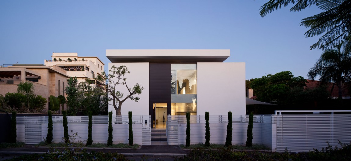
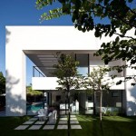
In an attempt to connect with the historic avenue and the houses that have inhabited it since the 1950’s, the architect has paid great attention to homes front facing façade. The front of the building is almost anonymous, for the most part, a closed element, free of unnecessary ornamentation and one that combines a monochromatic color scheme based on the grays and whites that characterized that same era. Only the floating upper roof hints at a harmony with contemporary design. There is a sense of acceptance of the avenues importance and an attempt to assimilate into its, fragile and gentle structure and in no way try to force contemporary architecture on the surrounding environment. Only the floating mass of the roof hints that, despite the desire to be part of the avenues context and the spirit of that historical period, it is clear to the observer that here we have a bold attempt to create an architectural language that leaves a clear signature and the fingerprint of the designer.
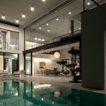
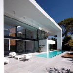
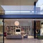
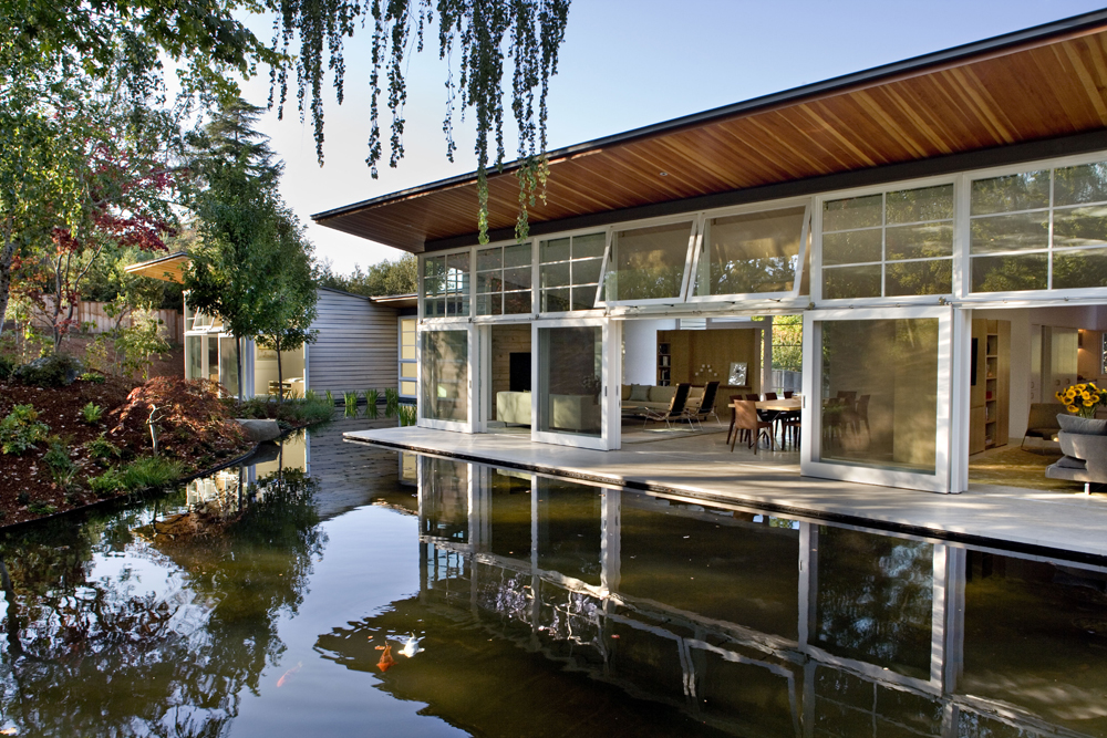
The home was, as said, designed around a wide, high public space that constitutes the connecting point and provides a view of all of the homes different wings as well as to the central courtyard and the pool. In order to further strengthen the impact of the central space it has been coated with exposed concrete panels and a large library on the wall as a central motif. A large, ribbon window allows light to enter deep into the space, creating movement and dynamism on the central wall. The architect has covered all of the structures spaces with an expansive roof which appears to be suspended, weightless in the air and floating effortlessly with no apparent means of support. The roof frames and consolidates the various parts of the structure with the apparent dissociation between the roof and the building creating an impressive, formal dialogue.
Movement within the house is accompanied by different views of the outside environment; exposed and open areas and other areas that are framed and focused on a specific view that was designed specifically for that area. The underlying concept of the homes design is one of quiet and formal restraint; the home is a place of tranquility and calm where the minimalistic details, the clean language and the meaning, separate the residents from the world outside. The architecture and the interior design combine a climatic relationship with light and air, an expression of the homes functionality and the uniform design lines both internal and external.
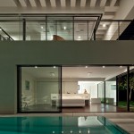
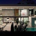
The materials and the colors used for both the interior and the exterior range from white to gray combined with wooden strips. The simple, clean shapes and the light play a central role in the interior design. Shade and light create ever changing performances of shapes and movement, “playing” on the walls, the ceilings and the floors of the building throughout the day. The combination of the geometric light shows against the horizontal and vertical surfaces, made from many different materials, creates a unique atmosphere in the internal spaces and the house’s exterior that make a powerful statement of uniformity and calmness. During the day, natural light entering the residence and its movement creates absorbing light shows. At night, when darkness falls, artificial light, and especially the light seeping out from the pool, create within the structures spaces a totally different atmosphere, one that is almost mystical and magical. The design of the courtyard is characterized by the same restraint of form with the choice of trees and their placement also communicates with the avenue and the surrounding environment. And so, despite the fact that different worlds and different eras exist in the space between the historical Bauhaus of the avenue and that of this modern and minimalistic home, there still exists a relationship between them, a feeling that one is not strange to the other.
- Contemporary Bauhaus on the Carmel – Pitsou Kedem – Israel
- Contemporary Bauhaus on the Carmel – Pitsou Kedem – Israel
- Contemporary Bauhaus on the Carmel – Pitsou Kedem – Israel
- Contemporary Bauhaus on the Carmel – Pitsou Kedem – Israel
- Contemporary Bauhaus on the Carmel – Pitsou Kedem – Israel
- Contemporary Bauhaus on the Carmel – Pitsou Kedem – Israel
- Contemporary Bauhaus on the Carmel – Pitsou Kedem – Israel
- Contemporary Bauhaus on the Carmel – Pitsou Kedem – Israel
- Contemporary Bauhaus on the Carmel – Pitsou Kedem – Israel
- Contemporary Bauhaus on the Carmel – Pitsou Kedem – Israel
- Contemporary Bauhaus on the Carmel – Pitsou Kedem – Israel
- Contemporary Bauhaus on the Carmel – Pitsou Kedem – Israel
- Contemporary Bauhaus on the Carmel – Pitsou Kedem – Israel
- Contemporary Bauhaus on the Carmel – Pitsou Kedem – Israel
- Contemporary Bauhaus on the Carmel – Pitsou Kedem – Israel
- Contemporary Bauhaus on the Carmel – Pitsou Kedem – Israel
- Contemporary Bauhaus on the Carmel – Pitsou Kedem – Israel
- Contemporary Bauhaus on the Carmel – Pitsou Kedem – Israel




No Comments