Google’s Newest Office – PENSON Group – UK
Architect: PENSON Group
Location: London, UK
Date: 2011
Type: Office interior
“Google’s Newest Office Looks Like A Space Station With Foosball Tables”
PENSON’s giddy design looks like a movie set, but beneath the glamour, it’s a place of work.
Would you like to work in a space station? Not the boring old real space station where conditions are quite cramped but a space station built by graduates of the Stanley Kubrick school of interior design? If so, I highly recommend that you get in touch with Google, and ask to be transferred to London.
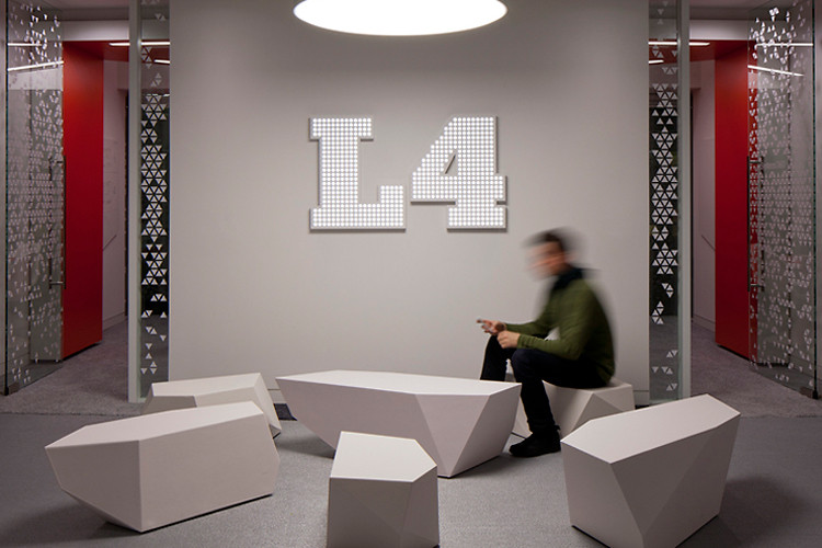
Designed by PENSON, Google Engineering’s new London offices are a giddy exercise in science fiction set decoration, replete with smooth white surfaces and bold solid colors. I’ll admit that as I paged through the publicity images, it was a little hard to take them seriously. But this is a real working space, and behind the glamour there are carefully considered affordances for Google’s working style.
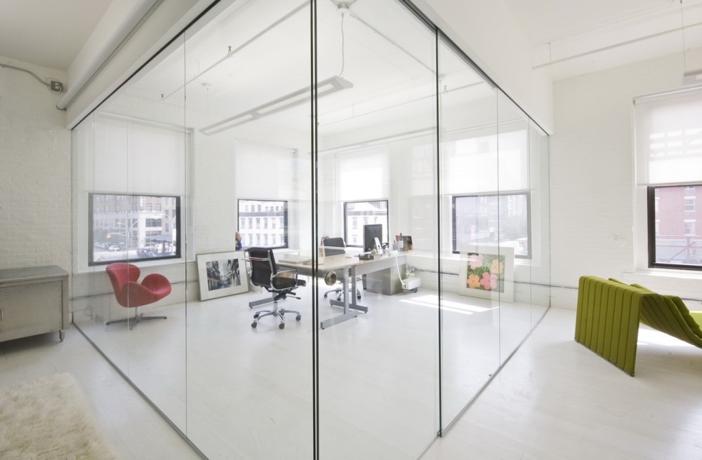
For example, unlike Kubrick’s eternally bare white corridors, PENSON intends that Google’s walls should be used. They are surfaced with magnetic whiteboard material. This allows engineers to sketch out solutions to problems, pin up working material, or project presentations as needed. All of the desks are height adjustable, and much of the floor space is given over to casual meeting spaces so that ad hoc teams and discussions can form as needed.
Besides, who’s to say that working spaces need to be ugly and drab? Assuming that the day to day conditions are as functional as PENSON says, the idea of heading into a fantasy spaceship environment for work puts a big smile on my face. Perhaps they can pipe in this loop of the Enterprise’s engines idling to complete the immersion. Via
- Google’s Newest Office – PENSON Group – UK
- Google’s Newest Office – PENSON Group – UK
- Google’s Newest Office – PENSON Group – UK
- Google’s Newest Office – PENSON Group – UK
- Google’s Newest Office – PENSON Group – UK
- Google’s Newest Office – PENSON Group – UK
- Google’s Newest Office – PENSON Group – UK
- Google’s Newest Office – PENSON Group – UK
- Google’s Newest Office – PENSON Group – UK
- Google’s Newest Office – PENSON Group – UK
- Google’s Newest Office – PENSON Group – UK
- Google’s Newest Office – PENSON Group – UK







No Comments