Vennesla Library – Helen & Hard – Norway
Architect: Helen & Hard
Location: Vennesla, Norway
Client: Vennesla Kommune
Date: 2011
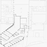
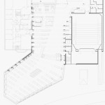
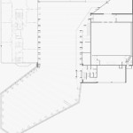
The new library in Vennesla comprises a library, a café, meeting places and administrative areas and links an existing community house and learning center together.
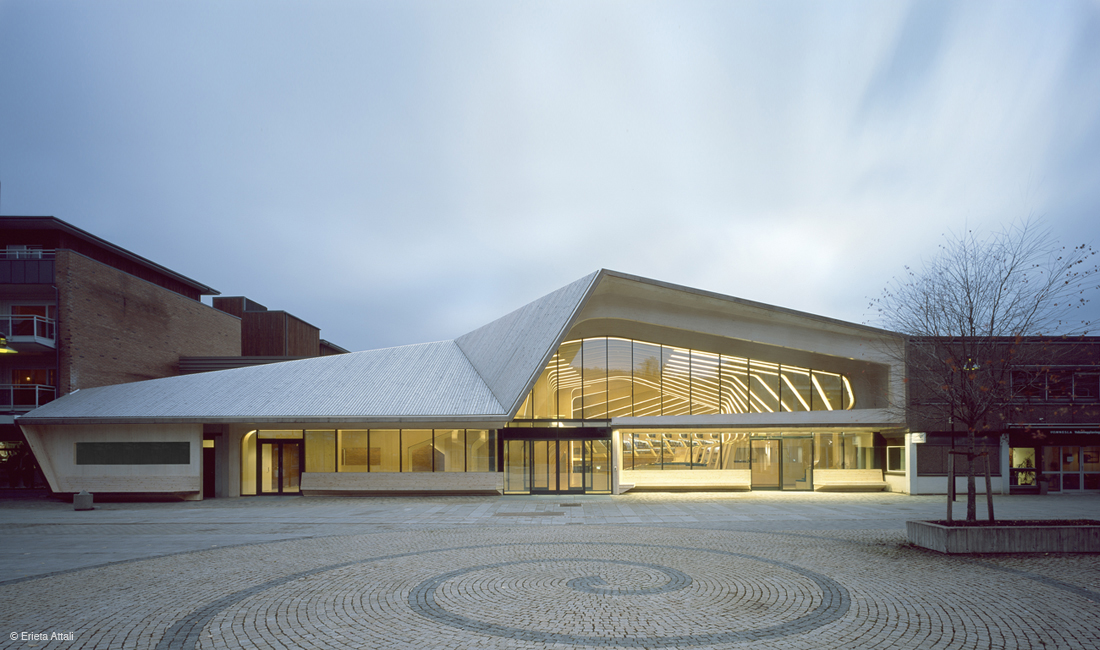
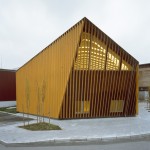
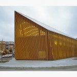
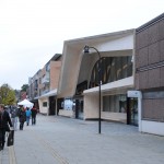
Supporting the idea of an inviting public space, all main public functions have been gathered into one generous space allowing the structure combined with furniture and multiple spatial interfaces to be visible in the interior and from the exterior. An integrated passage brings the city life into and through the building. Furthermore, the new building was open and easy accessible from the main city square, knitting together the existing urban fabric. This was achieved by a large glass facade and urban loggia providing a protected outdoor seating area.
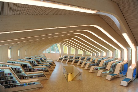
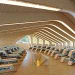
In this project, we further developed a rib concept to create useable hybrid structures that combine a timber construction with all technical devices and the interior. The whole library consists of 27 ribs made of prefabricated glue-laminated timber elements and CNC cut plywood boards. These ribs inform the geometry of the roof, as well as the undulating orientation of the generous open space, with personal study zones nestled along the perimeter.
Each rib consists of a glue laminated timber beam and column, acoustic absorbents which contain the air conditioning ducts, bent glass panes that serve as lighting covers and signs, and integrated reading niches and shelves.
The gradually shifting shapes of the ribs are generated through adapting to the two adjacent buildings and also through spatial quality and functional demands for the different compartments of the library. Each end façade has been shaped according to the specific requirements of the site. At the main entrance, the rib forms the loggia which spans the width of the entire square.
A main intention has also been to reduce the energy need for all three buildings through the infill concept and the use of high standard energy saving solutions in all new parts.
A symbiosis of structure, technical infrastructure, furniture and interior in one architectonic element creates a strong spatial identity that meets the client’s original intent to mark the city’s cultural center.
Team: Reinhard Kropf, Siv Helene Stangeland, Håkon Solheim, Caleb Reed, Randi Augenstein
- Vennesla Library – Helen & Hard – Norway
- Vennesla Library – Helen & Hard – Norway
- Vennesla Library – Helen & Hard – Norway
- Vennesla Library – Helen & Hard – Norway
- Vennesla Library – Helen & Hard – Norway
- Vennesla Library – Helen & Hard – Norway
- Vennesla Library – Helen & Hard – Norway
- Vennesla Library – Helen & Hard – Norway
- Vennesla Library – Helen & Hard – Norway
- Vennesla Library – Helen & Hard – Norway
- Vennesla Library – Helen & Hard – Norway
- Vennesla Library – Helen & Hard – Norway
- Vennesla Library – Helen & Hard – Norway
- Vennesla Library – Helen & Hard – Norway
- Vennesla Library – Helen & Hard – Norway
- Vennesla Library – Helen & Hard – Norway
- Vennesla Library – Helen & Hard – Norway



No Comments