Monolit Office Building – Igloo Architecture – Romania
Architects: Igloo Architecture
Location: Bucharest, Romania
Design Team: Bruno Andresoiu, Adrian Ciocazanu, Ana Dinuta, George Barbu, Andrei Creanga
Area: 3,600 m²
Year: 2012
Photographs: Courtesy of Igloomedia / Cosmin Dragomir
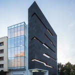
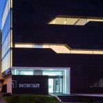
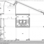
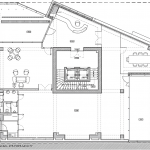
Although in appearance brutal, obscure and arrogant, the Monolit Office Building is actually the result of a careful negotiation between concerns pertaining to the urban environment, the neighbouring park and a series of functional constraints. As far as urban fabric is concerned, the site, found on the border of a protected area was marked by the existence of two blind walls, an uncertain alignment to the boulevard and the presence of neighbouring designs of debatable architectural orientation and qualities. However, the spot offered the opportunity of an insertion into a high traffic, prestigious area of the capital. Marked by the presence of the protected area and the two, vastly diverging adjoining configurations – on the one side, the curtain wall of an office building, on the other the full, processed facade of a residential building – the buildable contour was that of a broken line, both horizontally and vertically, architecturally re-forged around a central element.
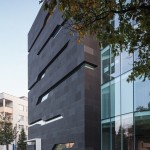
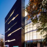
The major volume of the construction become a neutral, transparent backdrop that takes in the maximum possible amount of light and view over the park through a curtain wall that is uninterrupted by horizontal elements for the full height of the level, also serving in integrating the construction with the neighbouring buildings, while the third facade, a new invention, is encouraged to detach itself from the whole.
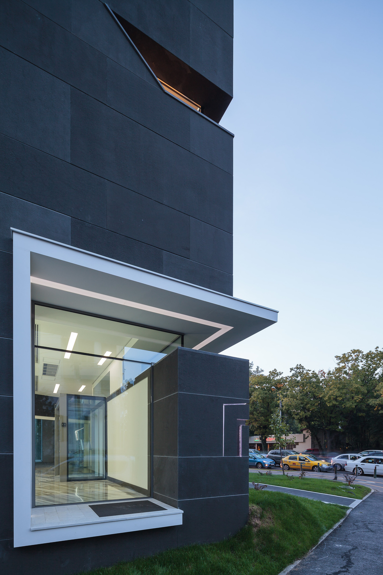
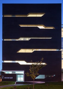
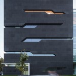
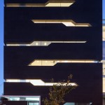
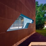
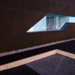
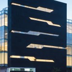
The plasticity of the prism, with its clean cut lines, makes the monolith stand out among the other stones and lends its the strength to impose order, stability and rigor. This shape best reflects the identity and aspirations of the client-company and creates a suggestive image. One of the key-elements that supported the formation of this image was the use of black granite – a natural, precious mineral that highlights the degree of solidity, with the black, in this case, clearly contributing even on a conceptual level to the architectural solution. Conceived according to the rhetoric of natural processes and of becoming in time, the windows stylize lines, fissures in the rock, and are carefully positioned in relation to the interior space so that from the inside they create landscape cut-outs – a different shape when you sit at your desk, stand, or walk about.
On the fifth floor, the main, transparent volume recedes from the black prism, allowing it to soar freely and creating terraces from whence the gaze can reach beyond the peaks of the trees in the park and take in the entire northern side of the city, while the green area dislodged by the building finds itself translates on a vertical scale in patches of green roof-terraces on the top two levels.
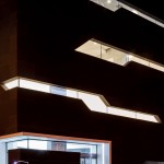
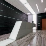
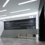
In the reception area one comes across the same neutral colours and oblique lines, while the granite is replaced with natural finish black slate, fine lines of light sneak past the edges of the stone panels, and the reception desk along with portions of the wall, ceiling and floor, form a portal of light. The purity of the architectural idea and the shape of this object, its clarity and proportions, its precise adaptation to its generating context, all of these are arguments in favour of less is more. In this sense, the result sought to achieve artistic and conceptual quality without fully surrendering to its context. Monolit seems to express the wish to be seen as being in accord with the territory, of becoming a point of respite, a black spot embodying the search for silence in the noise of the city.
- Monolit Office Building – Igloo Architecture – Romania
- Monolit Office Building – Igloo Architecture – Romania
- Monolit Office Building – Igloo Architecture – Romania
- Monolit Office Building – Igloo Architecture – Romania
- Monolit Office Building – Igloo Architecture – Romania
- Monolit Office Building – Igloo Architecture – Romania
- Monolit Office Building – Igloo Architecture – Romania
- Monolit Office Building – Igloo Architecture – Romania
- Monolit Office Building – Igloo Architecture – Romania
- Monolit Office Building – Igloo Architecture – Romania
- Monolit Office Building – Igloo Architecture – Romania
- Monolit Office Building – Igloo Architecture – Romania
- Monolit Office Building – Igloo Architecture – Romania
- Monolit Office Building – Igloo Architecture – Romania
- Monolit Office Building – Igloo Architecture – Romania
- Monolit Office Building – Igloo Architecture – Romania
Source: archdaily


No Comments